Wednesday 27 January 2010

Sequence


The final piece of my story board, I tried to capture the essence of a marvel comic strip, but used the colour red as the symbol blood and death, I should really this piece "Red Rum" in an echo of the film and book "The Shining".

The main plot to this storyboard is whether the man is really seeing things or is he going mad, I kinda did base it on the story line of "the Shining" but depicted it in a different way.

Man is lonely depress and full of regret, his house has not been clean for a while, decides to clean, has he is carryiing boxes and plates to the other side of the room he begins to see thing such as the box of bottles turning into bricks basically a metaphor for the weight of guilt on his life. "Did he murder someone?" " did he do something bad?". These are all the things that I have left out in story, for viewers to discuss.

Towards the end of the story a half empty cup ("Pessimisim") turns into a knife and then into a gun in which he inevitably shoots himself. Obviously a very confusing ending as to why a cup could kill someone, but I feel its a moral ending to whats real and what not.


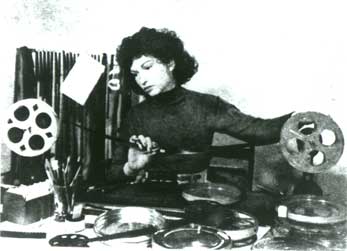
I love Maya Deren’s style of filming; her use of sudden transition between scenes inspires me. She was a pioneering thing back in 1940’s apparently, filming in that time wasn’t as common as it is now. I’ve come across her a couple of years ago when I was in A-level and just rediscovered her when thinking of an influence for quick transition and I found her on some blog.


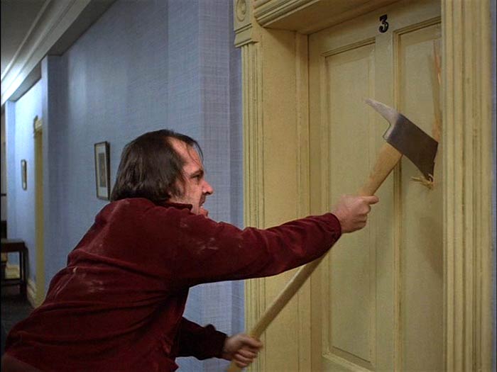
"The Shining" one of my main influences for this project. is a phsycological thriller made in the 1980s and directed by Stanley Kubrick. The film is ( as you can see by the picture) a bit weird, but none the less enjoyed it. I mainly focused on how the film was edited and directed with its transition between scene seemingly very perculiar. However at the same time I loved, instead it changes and relooks at the same scene with a different perspective, making it feel like its yourself that is going mad. So yeah basically this is how i want to represent my film and try to capture the image that "The Shining" portrays.

Monday 25 January 2010

Promotional poster and Book covers


Again I used the same method as before, as I wanted the poster to reflect off of the book illustrations. The poster made by felt tip pen apart from "the Camberwell press" which is a paper cut out. I wanted the poster to have the essence of the connections of London roads and tubes with out trying to make it look too geometric and keep its raw quality to it. I chose red as the main colour because red is a symbolic as well as a novelty trait with the London buses.


Bus: Journery between Camberwell to Parliament

Dizzy: Seven Dials

Obscure: Trafalgar Square

Relax: Brick Lane

Tap Tap : Bow Bells

My first intital thoughts was how was going to create 10 book covers and a poster in short period of times. I had to think of a way of depicting London onto a piece of paper. I decided to look at the transport system and look at the maps of the places I visited for this project, using the shapes of the roads as type, with every word connected up to look like roads or tubes.

The titles describe a word I feel that sums up the places.
Tap Tap: was the persistent sound that I kept hearing when I was there.
Dizzy: was a play on words with the whole seven streets surrounding you.

Relax: I felt was the atmosphere I was in, there were a lot laid back people and a lot cafes and bar in which you can relax and socialize.

Bus: was an obvious choice however I put the B onto its side to make it look like a bus.
Obscure: was a word to describe the gigantic statues with.. well obscure lions in the middle of the square.

Book Illustration


We spent the whole 3 days walking non stop stop through london, writing notes of the surroundings, thoughts and feelings about the place you were in. Then take a picture and drawing a site of the place that you are in that you think is memoriable to you.
We only just discovered our bring on the fifth day, create 10 book covers for a guide to London, and then finish it off with a promotional poster. a similar style has to be used for every book cover.

Magical Museum Exibit


The rest of the process was done through Letter press in which mistakenly used the same type for "IN 3D" as the type they used on cinema posters.

Here is my final piece for my poster, I tried to make the theme of 3D stand out more by actually making the poster come out the viewer. The "M" in the middle is made out of black card and stuck with glue. The "M" itself stand for Mammoth and I tried to shape it so it looked like a mammoth, it was a bit of an obvious idea but I really liked it.

This is my final piece for the exhibition, however I feel it is incomplete. I spent so much time on the Mammoth sculptures that the outcome looks a bit bleak. I really want to take exhibit to the photography department and take some pictures there, that way I can put a white sheet on the background to give it a better effect.


Using the technique of Karen Sargsyan, I created three wooly Mammoths out of wired mesh and cut outs of pieces of paper. For each layer I had cut out lines around the paper to give the Mammoth's a flare effect to their structure and give them a lift. I'm really pleased with the results, feeling that the outcome was better than I expected. I want to place them into something which I can exhibit. One of my ideas is based around making the exhibit a theme of 3D and layer the image so that the pieces are divided.

Elizabeth Berrien


A wire sculpture based in California, creates peculiar life like animals, giving off an essence of realism. Her technique is unique, using only wire cutters and her complex interweaving with wire. A lot of work has been based around the world, in fine art galleries as well as work for big companies such as BBC, Motorola,Disney World, Saatchi & Saatchi.

Berrien's work has been an inspiration to many artists and has become a pioneer of wire sculpting. Their appearances seem very fragile but Berrien focus's on the emotions of the animal, and creates a freeze frame.

I want to an element of her style and project it in my own.

Biliography:
http://www.wirelady.com/berrienwirepresspage.html

Karen Sargsyan


I discovered Karen Sargsyan's work when I was browsing through the "Booooooomed" blog. I instantly fell in love with his timeless characterized paper sculptures. He uses cut out heavy duty paper and shapes his figures into peculiar captured freeze frames. His work creates a symbolic meaning to his figures and captures a story within a moment, giving deeper meaning to his exhibits. A lot of his sculptures reflect human emotion, with the common looks of pain and suffering.

By using this technique I want to create similar sculptures to this but in the form of animals such as, Mammoths, created either one big one or many little ones.


Bibiography:
http://www.nytimes.com/2009/05/03/nyregion/westchester/03artwe.html

Magical Museum


My project for the winter holidays.. I had to go to a local museum in my near by town, which in this case is the Ipswich Natural history Museum. Be fascinated by an exhibit, take pictures, drawings, research it and then create an alternative exhibit for an exhibition in the first week of term as well as creating a publication and poster to advertise it. Sounds like its gonna be a lovely holiday. The project is also gonna be collaborated with the 2nd years and will join our final exhibtion. My main attraction of this trip was to look at the stuffed animals (or fake as it were).

When taking my first step into the I was immediately facinated by this gigantic wooly mammoth, good things for a first time, saving time for something else I wanted to look at.

Friday 15 January 2010

Letter Chair Poster


As you can see I have created my typeface using the screen print technique, I decided to use two different colours and by accident discovered the colour gold which has given my final pieces a nice finish. The type came out really clear and I was really pleased with it. However due to a few mistakes and other experiments with my other part to the screen print, the border didn't go to plan as I hoped.

This is something I made up in Illustrator for preparation of screenprinting. The image will be divided into two parts (border, then alphabet by itself.)


I started off creating my type today, my plan was to create each letter of the alphabet and bend each one into a letter. For a long time i've wanted to created a type face but haven't had the chance to do so. It was a time consuming task as well as being very important. I want to corrospond this idea with my Final Letter chair. Chairs that are for comunial around London, placed in parks, bus stops shopping streets etc.

Letter Chair.


Dror Benshetrit- Wall chairs
Eric Ku- Chair

Saturday 2 January 2010

If only I had more time. Christmas holidays is almost to an end, having so much fun really does distract you. If only i had a Bernard's watch.


The program was one of my all time favourite children's program. The acting was a bit poor but the idea was there at least. It would of solved a lot of problems and give me more time to do work.